

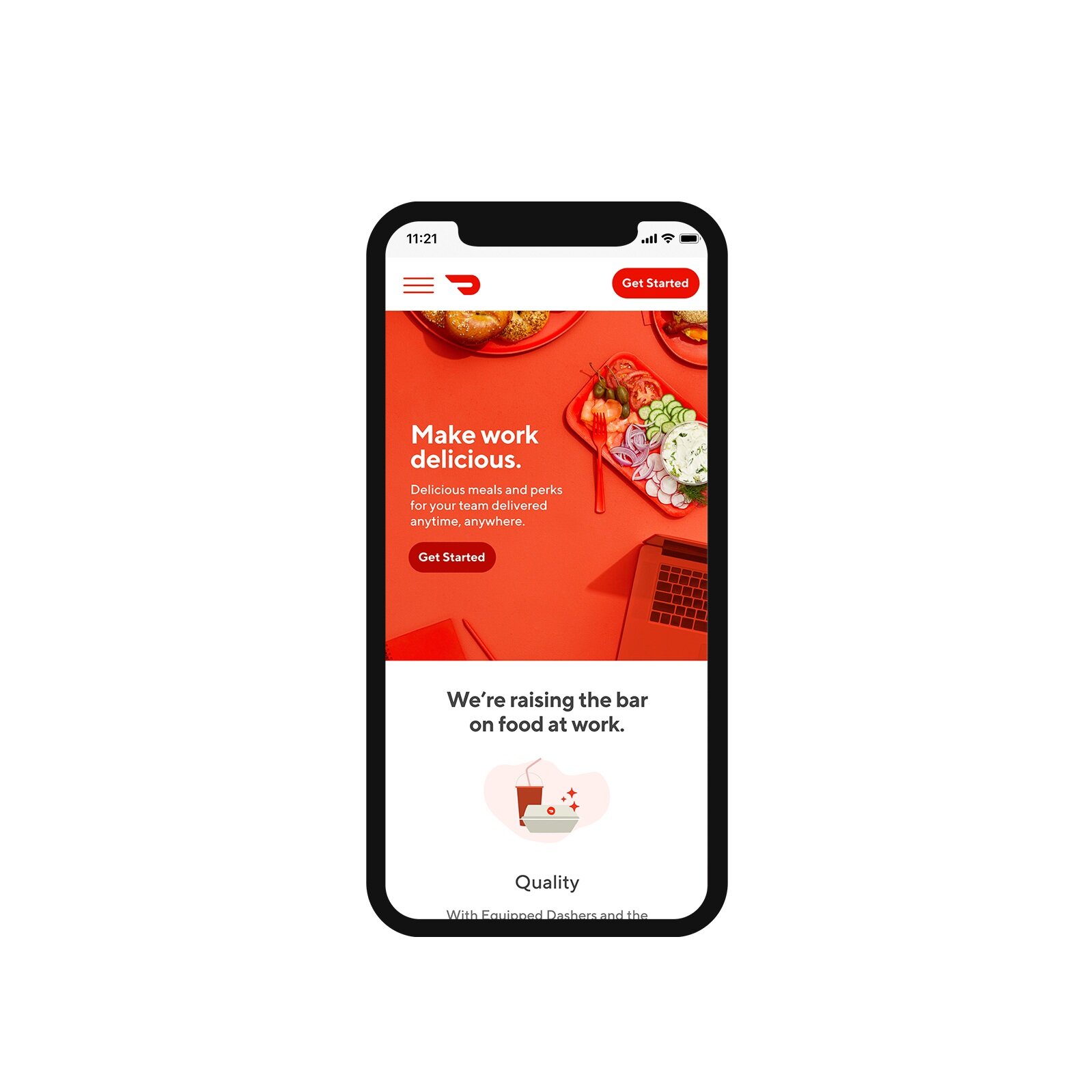
DoorDash’s product for eating at work gets a fresh look.


When DoorDash for Business became DoorDash for Work, our product needed a branding overhaul to evolve with its name. Our band team decided on a bold, monochromatic visual style, pulling from DoorDash’s brand guidelines to establish a distinct and exciting look for this particular product. A primary colored top down photoshoot establishes our hero imagery, supported by brand illustration to hold up our product’s value props.

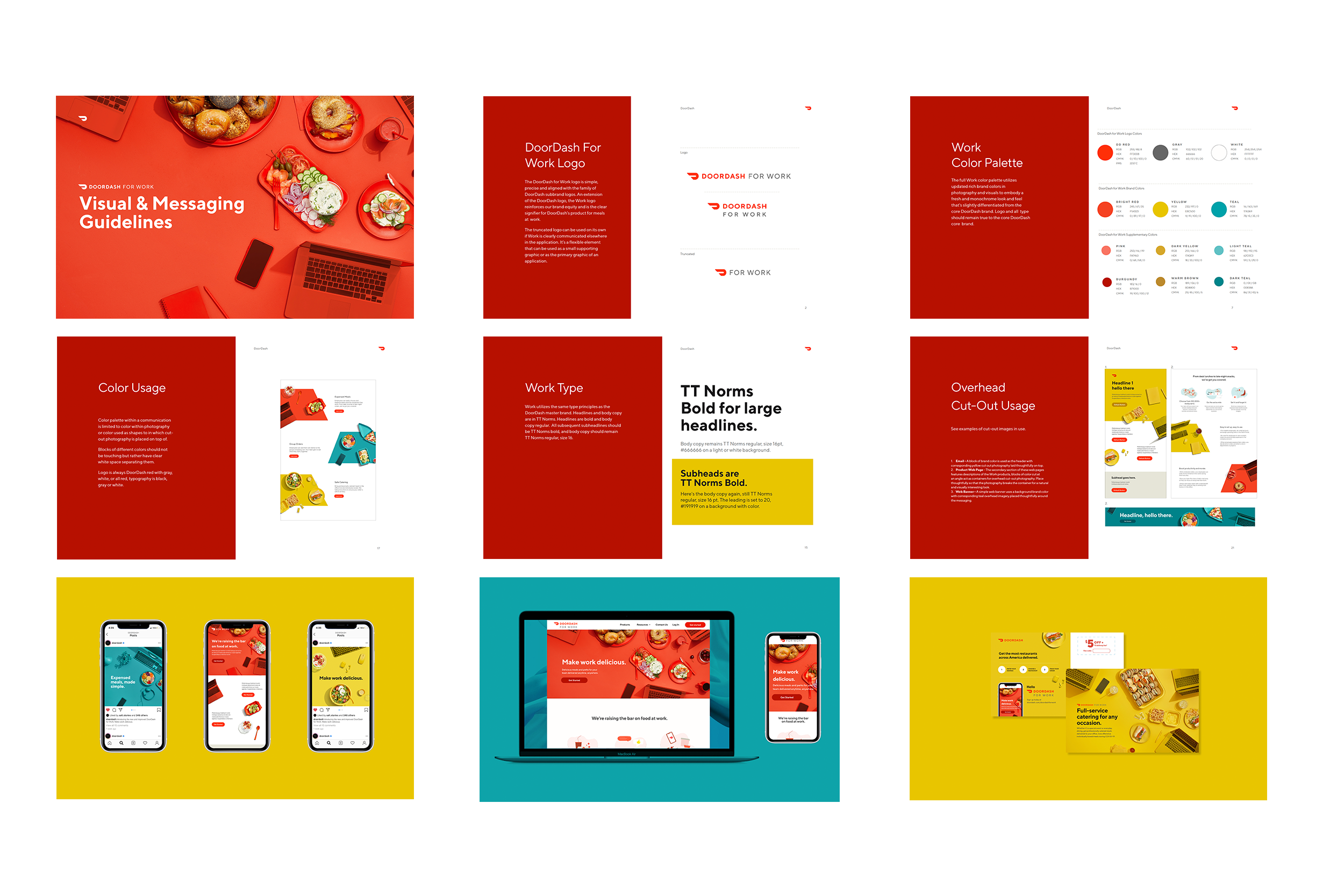
To help partners both in-house and outside of DoorDash, an extensive Visual Styleguide was built, complete with logo guidelines, do’s and don’ts and helpful examples. This is a just a glance at some of the pages within.